What's new
Cursed Domains

This is a sample guest message. Register a free account today to become a member! Once signed in, you'll be able to participate on this site by adding your own topics and posts, as well as connect with other members through your own private inbox!

Basic Coding

Administrator

The Waking Presence
Staff member
Administrator
Credits
4,086

Attachments

  • 1703905383454.png
    1703905383454.png
    7.5 KB · Views: 3
  • 1703947523931.png
    1703947523931.png
    570 bytes · Views: 6
  • 1703951966425.png
    1703951966425.png
    494 bytes · Views: 1
  • 1703952176721.png
    1703952176721.png
    17 KB · Views: 3
  • 1703953286061.png
    1703953286061.png
    17 KB · Views: 3
  • 1703953562311.png
    1703953562311.png
    422 bytes · Views: 1
  • 1703953662414.png
    1703953662414.png
    498 bytes · Views: 1
  • 1703983640726.png
    1703983640726.png
    316 bytes · Views: 0
  • 1703983669298.png
    1703983669298.png
    289 bytes · Views: 0
  • 1703983690091.png
    1703983690091.png
    427 bytes · Views: 0
Last edited:
Use of the Post Bar

On the top of your posts you will notice a Post Bar. Your post bar will adjust according to screen size as it is our goal to ensure mobile safe settings so if there is an issue with your display, please reach out with screenshots. That said, your post should look similar to the following screengrab on a large screen. Smaller screens, such as phones have abbreviated options due to the surface area buttons require.

1703897774280.png

This post will review what each button does and the equivalent custom BB code you can input.

Remove Formatting
This button will remove any special formatting code. So for example if you had a section colored, bolded and italicized, you can highlight over that area and then click this button to remove that formatting from that section of the text. Without this button, you would have to manually remove the relevant formatting code.


Bold
This will make your highlighted text bold. This can also be done by using [b] around a desired set of words like so [b]words[/b] to have the following desired effect words.


Italics
This will make your highlighted text italicized. This can also be done using [i] around a desired set of words like so [i]words[/i] to have the following desired effect words.


Font Size
This is a drop down and this will make your highlighted text your desired size. Ranging from quite small to rather large. This can also be done using [size=] with a numerical choice after the equal sign (=), so [size=18]words[/size] to have the following desired effect words.


Text Color
When clicked, a series of colors will be offered for use. There is also a hex code box where you can enter a hex code of choice. There are multiple ways a user can manually pick a favorite color that is not offered on the palate.

  • Short Hand 3 Digit Hexadecimal, which looks something like this [color=#B6F]words[/color] with an output that looks like this words. Here is a tool for finding the 3 digit code you are looking for.
  • Short Hand 6 Digit Hexadecimal, which looks something like this [color=#BB66FF]words[/color]. Here is a tool for finding the 6 digit code you are looking for
  • Color Names, which are basically a series of pre-set names such as [COLOR=teal]words[/COLOR] with an output that looks like this words. A copy of the color names can be found in the below alongside their Hex and Decimal alternatives. These are not as wide-spread so you may not be able to find the perfect color via this method but names are generally easier for most to remember.


Font Family
This is a drop down that lists several available fonts.
  • Arial (a sans-serif font)
  • Book Antiqua (a serif font)
  • Courier New (a monospace font)
  • Georgia (a serif font)
  • Tahoma (a sans-serif font)
  • Times New Roman (a serif font)
  • Trebuchet MS (a sans-serif font)
  • Veranda (a sans-serif font)
All fonts can also be manually added with the [font=insert font name here], so for example [font=courier new]when I use this code for a font[/font] the output would look like this when I use this code for a font.


More Options
To the immediate right of Font Family there is 3 vertical dots that represent additional options which will open up if clicked.

More Options offers strike through, inline spoilers such as this, LaTeX which allows for the display of mathematical equations and Time.


List
This drop down offers several options including ordered list, undordered List, indent and outdent. Lists can serve multiple functions, they can create lists:

Ordered ListUnordered List

  1. Item 1
  2. Item 2
  3. Item 3
  4. Item 4
This automatically indents once and will automatically apply a number with each enter.
  • Item 1
  • Item 2
  • Item 3
  • Item 4
This will simply bullet each entry with every enter and automatically indents the list.

The Indent functions move the list to the right and the outdent function moves the list to the left. This makes no difference in the ordered list but it will change the appearance of an unordered list. See below for an example:

Ordered ListUnordered List

  1. Item 1
    1. Item 2
      1. Item 3
        1. Item 4
With each indent the numbers start all over again automatically and the text moves to the right.
  • Item 1
    • Item 2
      • Item 3
        • Item 4
With each intent to the third level, the bullet will change and the bullet will move to the right.

This can also be manually typed into a post without button assistance. The code for making a list is as follows:
Code ExampleOutput
[list][*]Item 1 [*]Item 2 [*]Item 3 [*]Item 4[/list]
  • Item 1
  • Item 2
  • Item 3
  • Item 4
[list=1][*]Item 1 [*]Item 2 [*]Item 3 [*]Item 4[/list]
  1. Item 1
  2. Item 2
  3. Item 3
  4. Item 4
Note that the command to make a list is simply LIST between brackets. Each item in the list is marked by an asterix (*) flanked by a pair of [brackets]. To make it an ordered list, simply add =1 to the list command.

The command for indent is simple [indent] and to outdent, simply end the indent command with [/indent] This can be used in lists as well as to format posts in aesthetically pleasing ways.
[list=1][*]Item 1 [indent][list][*]Bulleted Point 1 [*]Bulleted Point 2[/list][/indent] [*]Item 2 [*]Item 3[/list]
  1. Item 1
    • Bulleted Point 1
    • Bulleted Point 2
  2. Item 2
  3. Item 3
Below is a code example of using the indent to indent a paragraph:
Lorem ipsum dolor sit amet, consectetur adipiscing elit. Suspendisse a tempus nulla. Praesent hendrerit metus ut orci auctor commodo. Nunc at justo felis. Curabitur enim purus, faucibus eget blandit porta, rutrum a nisi. Cras pharetra sodales odio. Vivamus posuere, elit non sagittis consectetur, tortor sem porta quam, vel ornare augue augue in lorem. Sed ut condimentum risus. [indent]Mauris odio neque, blandit quis consectetur eu, rhoncus vel lectus. Proin feugiat rutrum convallis. Donec vehicula odio et rutrum rhoncus. Orci varius natoque penatibus et magnis dis parturient montes, nascetur ridiculus mus. Nulla rhoncus convallis lacus, et blandit arcu volutpat eleifend. Morbi turpis quam, rhoncus a blandit at, mollis id erat. Etiam egestas aliquam efficitur. Vivamus nulla nunc, porttitor eu lacus sed, lobortis bibendum turpis. Phasellus quis dictum justo. Sed maximus tempus mollis. Quisque enim purus, scelerisque tempor molestie non, rhoncus eu erat. Cras nibh lacus, laoreet sed vehicula in, pellentesque vel nunc.[/indent]
Lorem ipsum dolor sit amet, consectetur adipiscing elit. Suspendisse a tempus nulla. Praesent hendrerit metus ut orci auctor commodo. Nunc at justo felis. Curabitur enim purus, faucibus eget blandit porta, rutrum a nisi. Cras pharetra sodales odio. Vivamus posuere, elit non sagittis consectetur, tortor sem porta quam, vel ornare augue augue in lorem. Sed ut condimentum risus.

Mauris odio neque, blandit quis consectetur eu, rhoncus vel lectus. Proin feugiat rutrum convallis. Donec vehicula odio et rutrum rhoncus. Orci varius natoque penatibus et magnis dis parturient montes, nascetur ridiculus mus. Nulla rhoncus convallis lacus, et blandit arcu volutpat eleifend. Morbi turpis quam, rhoncus a blandit at, mollis id erat. Etiam egestas aliquam efficitur. Vivamus nulla nunc, porttitor eu lacus sed, lobortis bibendum turpis. Phasellus quis dictum justo. Sed maximus tempus mollis. Quisque enim purus, scelerisque tempor molestie non, rhoncus eu erat. Cras nibh lacus, laoreet sed vehicula in, pellentesque vel nunc.​


Alignment
this drop down offers four different alignment options: left, right, center and justified.

This is left aligned:

Lorem ipsum dolor sit amet, consectetur adipiscing elit. Suspendisse a tempus nulla. Praesent hendrerit metus ut orci auctor commodo. Nunc at justo felis. Curabitur enim purus, faucibus eget blandit porta, rutrum a nisi. Cras pharetra sodales odio. Vivamus posuere, elit non sagittis consectetur, tortor sem porta quam, vel ornare augue augue in lorem. Sed ut condimentum risus.

Mauris odio neque, blandit quis consectetur eu, rhoncus vel lectus. Proin feugiat rutrum convallis. Donec vehicula odio et rutrum rhoncus. Orci varius natoque penatibus et magnis dis parturient montes, nascetur ridiculus mus. Nulla rhoncus convallis lacus, et blandit arcu volutpat eleifend. Morbi turpis quam, rhoncus a blandit at, mollis id erat. Etiam egestas aliquam efficitur. Vivamus nulla nunc, porttitor eu lacus sed, lobortis bibendum turpis. Phasellus quis dictum justo. Sed maximus tempus mollis. Quisque enim purus, scelerisque tempor molestie non, rhoncus eu erat. Cras nibh lacus, laoreet sed vehicula in, pellentesque vel nunc.

This is right aligned:

Lorem ipsum dolor sit amet, consectetur adipiscing elit. Suspendisse a tempus nulla. Praesent hendrerit metus ut orci auctor commodo. Nunc at justo felis. Curabitur enim purus, faucibus eget blandit porta, rutrum a nisi. Cras pharetra sodales odio. Vivamus posuere, elit non sagittis consectetur, tortor sem porta quam, vel ornare augue augue in lorem. Sed ut condimentum risus.

Mauris odio neque, blandit quis consectetur eu, rhoncus vel lectus. Proin feugiat rutrum convallis. Donec vehicula odio et rutrum rhoncus. Orci varius natoque penatibus et magnis dis parturient montes, nascetur ridiculus mus. Nulla rhoncus convallis lacus, et blandit arcu volutpat eleifend. Morbi turpis quam, rhoncus a blandit at, mollis id erat. Etiam egestas aliquam efficitur. Vivamus nulla nunc, porttitor eu lacus sed, lobortis bibendum turpis. Phasellus quis dictum justo. Sed maximus tempus mollis. Quisque enim purus, scelerisque tempor molestie non, rhoncus eu erat. Cras nibh lacus, laoreet sed vehicula in, pellentesque vel nunc.​

This is center aligned:

Lorem ipsum dolor sit amet, consectetur adipiscing elit. Suspendisse a tempus nulla. Praesent hendrerit metus ut orci auctor commodo. Nunc at justo felis. Curabitur enim purus, faucibus eget blandit porta, rutrum a nisi. Cras pharetra sodales odio. Vivamus posuere, elit non sagittis consectetur, tortor sem porta quam, vel ornare augue augue in lorem. Sed ut condimentum risus.

Mauris odio neque, blandit quis consectetur eu, rhoncus vel lectus. Proin feugiat rutrum convallis. Donec vehicula odio et rutrum rhoncus. Orci varius natoque penatibus et magnis dis parturient montes, nascetur ridiculus mus. Nulla rhoncus convallis lacus, et blandit arcu volutpat eleifend. Morbi turpis quam, rhoncus a blandit at, mollis id erat. Etiam egestas aliquam efficitur. Vivamus nulla nunc, porttitor eu lacus sed, lobortis bibendum turpis. Phasellus quis dictum justo. Sed maximus tempus mollis. Quisque enim purus, scelerisque tempor molestie non, rhoncus eu erat. Cras nibh lacus, laoreet sed vehicula in, pellentesque vel nunc.​

This is justified:

Lorem ipsum dolor sit amet, consectetur adipiscing elit. Suspendisse a tempus nulla. Praesent hendrerit metus ut orci auctor commodo. Nunc at justo felis. Curabitur enim purus, faucibus eget blandit porta, rutrum a nisi. Cras pharetra sodales odio. Vivamus posuere, elit non sagittis consectetur, tortor sem porta quam, vel ornare augue augue in lorem. Sed ut condimentum risus.

Mauris odio neque, blandit quis consectetur eu, rhoncus vel lectus. Proin feugiat rutrum convallis. Donec vehicula odio et rutrum rhoncus. Orci varius natoque penatibus et magnis dis parturient montes, nascetur ridiculus mus. Nulla rhoncus convallis lacus, et blandit arcu volutpat eleifend. Morbi turpis quam, rhoncus a blandit at, mollis id erat. Etiam egestas aliquam efficitur. Vivamus nulla nunc, porttitor eu lacus sed, lobortis bibendum turpis. Phasellus quis dictum justo. Sed maximus tempus mollis. Quisque enim purus, scelerisque tempor molestie non, rhoncus eu erat. Cras nibh lacus, laoreet sed vehicula in, pellentesque vel nunc.​

This can also be accomplished with the following tags placed before and after the content that you wish to align. Please be aware that the default alignment is left aligned.
[left]Content here[/left] [right]Content here[/right] [center]Content here[/center] [justified]Content here[/justified]


Paragraph Format
this drop down offers several easy to access heading options.

Heading 1

the shorthand code for this for manual entry is [H1]Insert Content Here[/H1].

Heading 2

the shorthand code for this for manual entry is [H1]Insert Content Here[/H2].

Heading 3

the shorthand code for this for manual entry is [H1]Insert Content Here[/H3].

Heading 4

the shorthand code for this for manual entry is [H1]Insert Content Here[/H4].


More Options
To the immediate right of Paragraph Format there is 3 vertical dots that represent additional options which will open up if clicked.

More Options offers Anchor, Accordion, Tabs, Encarde, Mod: Alert, Mod: Info, Mof: Stop, Mod: Warning, and Slider. These are advanced codes.


Anchors
An anchor is used to quickly move someone to a certain part of a post. Commonly used in tables of contents. This thread uses this in the table of contents.

The anchor key provides a pop-up to assist users in making anchors (see below).

1703947781492-png.62


The easiest way to use this is to pick a name, number of symbol and place that where you want the user to be directed and then use this button to place the symbol. This symbol will be invisible and serves as an anchor, it is the destination. This can also be manually achieved with the following manually written code [anchor]I am an Anchor[/anchor] and if it was in a post it would look like this. Look at that gap. That gap is where the anchor is! Remember this placement because it will become relevant shortly.

The same anchor key can be used to make the go-to command, notice in the pop-out how there are two tabs: In post anchor target and anchor link. The anchor opens up on In post anchor target (the destination) as a default, the start point is the anchor link tab. This creates a hyperlink that will move you to the destination of choice. Below is an image of what the Anchor Link Tab looks like (see below):

1703948424096-png.63


This is not looking for a URL, the anchor link is more like a connection or a likeness. So the Anchor Link is the starting point and would be the term or phrase that is going to be linked to the the anchor destination. The Link text is what will show up on the post, this is not invisible. Below is an example of how this might look (see below).
1703949022768-png.64

The manual code input for this would look like this: [anchor="I am an Anchor"]This is what shows up![/anchor] and it would look like this in a post: This is what shows up!. Click it and see what happens!


Accordion
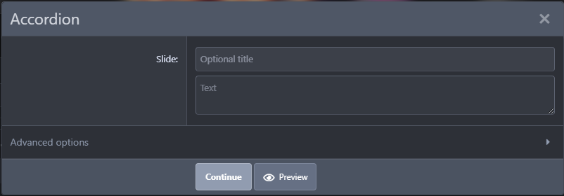
This entire post is built off of an accordion. This is a way of cleanly displaying data. By clicking on the button of choice, the contents open below. When you click on the accordion button, there is a pop-up to assist users in the input of this code (see below).

1703952176721-png.66


This pop out serves to fill the two areas of the Accordion: the title area and the content. When you fill the first slide, the option to fill out the second slide will be offered and so on. You can simply drop the code in these windows and the site will compile the code for you. Alternatively, if you prefer to do this manually or need to later add a slide or content, the following code is what is used:

[ACCORDION] [SLIDE_HEADER] Test title 1 [/SLIDE_HEADER] [SLIDE] words inside here [/SLIDE] [SLIDE_HEADER] Test title 2 [/SLIDE_HEADER] [SLIDE] more words inside of here [/SLIDE] [SLIDE_HEADER] Test title 3 [/SLIDE_HEADER] [SLIDE] still more words inside of here [/SLIDE] [/ACCORDION]

This is rather similar to how tables are made. You would use the code [accordion][/accordion] as the most external codes. Next, you would use the slide header code [slide_header]Name of Slide Here[/slide_header] to provide the name of the slide. Next, you would use the slide code to make the individual slide using [slide]Content of the slide here[/slide]. These slides can contain BB code as evidenced by this guide. The output of the above example would look something like this (see below).


Test title 1

words inside here


Test title 2

more words inside of here


Test title 3

still more words inside of here

Tabs
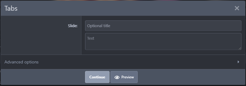
are another unique way to display data. Similar to the accordion, only rather than having a vertical array of buttons, this has a left to right configuration. By clicking on the button of choice, the contents open below. When you click on the tab button, there is a pop-up to assist users in the input of this code (see below).

1703953286061-png.67


This pop out serves to fill the two areas of the Tab: the title area and the content. When you fill the first slide, the option to fill out the second slide will be offered and so on. You can simply drop the code in these windows and the site will compile the code for you. Alternatively, if you prefer to do this manually or need to later add a slide or content, the following code is what is used:

[TABS] [SLIDE_HEADER] Test title 1 [/SLIDE_HEADER] [SLIDE] words inside here [/SLIDE] [SLIDE_HEADER] Test title 2 [/SLIDE_HEADER] [SLIDE] more words inside of here [/SLIDE] [SLIDE_HEADER] Test title 3 [/SLIDE_HEADER] [SLIDE] still more words inside of here [/SLIDE] [/TABS]

This is rather similar to how tables are made. You would use the code [tabs][/tabs] as the most external codes. Next, you would use the slide header code [slide_header]Name of Slide Here[/slide_header] to provide the name of the slide. Next, you would use the slide code to make the individual slide using [slide]Content of the slide here[/slide]. These slides can contain BB code as evidenced by this guide. The output of the above example would look something like this (see below).

  • words inside here
  • more words inside of here
  • still more words inside of here


Encarde
This is another unique way to display text. By clicking on the button of choice, the contents open below. When you click on the tab button, there is a pop-up to assist users in the input of this code (see below).

1703953941603-png.70


Default settings for encarde are 20%, floating text right and left alignment. What this means: the box will take up 20% of the given area, that this box will be located on the right side of the post but text can we written alongside this and if the text is longer than the encarde, the text will wrap around this box like a floated image and the text inside the encarde will be left aligned. You can change all of this in advanced settings (see the bottom of the pop out) which looks like this (see below).

1703954293922-png.71


You are able to customize and even preview the appearance of the encarde before it is posted.

This code can also be manually entered without assistance with the following code:

[ENCADRE title="Test title" block_align="fright" title_align="left" width="30%"] words inside here This is a sort of mobile-safe (due to percentage screen use) means of displaying text that can even float! [/ENCADRE]

In this example we have the encarde command followed by a space then the word title with an equal sign, you would then place in quotation marks the title of this block. This would be followed by the block alignment using the term block_align an equal sign and then fright in this case to float right. If I had entered fleft this would have floated to the left. I could have also chose left, right or center without floating if I so desired. This alignment is in quotation marks. This is followed by title align which is basically the alignment of the text within the block. This can be again left, right, center and is surrounded by quotation marks. Finally, there is the size which is in this case since 30% which is encased in quotation marks. We end the bracket here add text to the block and when we are complete we end it with [/encarde] to end this function.

Slider
Another unique way to display code like encarde, tabs and accordion/ This will display multiple tabs but there will be no title, rather left and right arrows. If you click the left and right arrow, the information on the card (like flashcards) will change over. By clicking on the button of choice, the contents open below. When you click on the tab button, there is a pop-up to assist users in the input of this code (see below).

1703960294874-png.74


This pop out serves to fill the two areas of the Slider: the title area and the content. When you fill the first slide, the option to fill out the second slide will be offered and so on. You can simply drop the code in these windows and the site will compile the code for you. Alternatively, if you prefer to do this manually or need to later add a slide or content, the following code is what is used:

[SLIDER] [SLIDE_HEADER] Title 1 [/SLIDE_HEADER] [SLIDE] This is where some words can be found [/SLIDE] [SLIDE_HEADER] Title 2 [/SLIDE_HEADER] [SLIDE] This is where some more words can be found [/SLIDE] [SLIDE_HEADER] Title 3 [/SLIDE_HEADER] [SLIDE] This is where even more words can be found [/SLIDE] [/SLIDER]

You can also use Advanced Options for even more control of your Slider.

1703960500950-png.75


Mod: Alert | Mod: Information | Mod: Stop | Mod: Warning
These four buttons from left to right Mod: Alert creates a yellow box, Mod: Information creates a blue box, Mod: Stop creates a red box, Mod: Warning creates an orange box.Upon clicking any of the four buttons you will be prompted to give a title and the following code would be planted in the page (see below).

[ALERT="Mod Alert Title Placed Here"] [/ALERT]

The output would look like this (see below).

[ALERT="Mod Alert Title Placed Here"] [/ALERT]

You will notice a lot of empty space in this box. This can be manually filled with additional information. For example:

[ALERT="Mod Alert Title Placed Here"] Lorem ipsum dolor sit amet, consectetur adipiscing elit. Sed placerat, turpis a placerat finibus, nisl ligula dignissim velit, quis accumsan urna tortor at odio. Duis et nisl in enim gravida feugiat a vel dui. Pellentesque ut orci nibh. Nam vulputate faucibus efficitur. Vestibulum porttitor augue id ultricies bibendum. Aliquam varius, sapien id ultricies efficitur, elit felis blandit urna, id scelerisque ex nisi sed felis. In hac habitasse platea dictumst. In hac habitasse platea dictumst. Nunc id ornare ante. Ut nec sem leo. Sed faucibus, velit eget laoreet eleifend, mi velit venenatis lectus, a mollis neque massa eu tortor. Quisque condimentum consequat sapien vel luctus. Etiam turpis quam, lobortis nec nulla sed, consectetur lacinia dolor. Fusce bibendum augue sed arcu molestie, id laoreet sem dignissim. Lorem ipsum dolor sit amet, consectetur adipiscing elit. Suspendisse tortor urna, luctus non ligula at, fringilla interdum tortor. Vestibulum eget urna eget enim fringilla volutpat. Morbi in quam dignissim, interdum tellus a, elementum massa. Maecenas vel dolor cursus, porta nisi iaculis, efficitur metus. Quisque eros nisi, cursus in mi nec, lobortis elementum neque. In rhoncus mauris vitae enim ultricies commodo. Pellentesque commodo tempor pulvinar. Sed viverra bibendum quam, et bibendum nibh blandit in. Aenean varius urna vitae tortor vulputate lobortis. Pellentesque rutrum non tortor in pellentesque. Nulla ullamcorper molestie dui vel rhoncus. In tincidunt porta dolor, ac aliquam urna condimentum at. Nam vitae nisl et mauris rhoncus malesuada quis vel tortor. Morbi eu metus eu enim varius porttitor. In eu sem egestas, dictum arcu quis, placerat velit. Duis ullamcorper, sem eu eleifend commodo, purus nisl mollis mauris, id ullamcorper massa nisl quis elit. Sed suscipit nibh quis tristique luctus. Ut libero neque, imperdiet vel mauris vitae, hendrerit feugiat nunc. Sed tincidunt posuere velit eget facilisis. Curabitur ut est in odio interdum viverra. Donec faucibus aliquam rhoncus. Mauris sed consequat dolor. Quisque accumsan risus quis mollis volutpat. Donec dictum est nec ligula porta congue. Mauris et neque vitae ex laoreet mollis. Suspendisse in maximus sapien, ut vehicula sapien. Vestibulum luctus metus id sapien varius, vitae vehicula leo euismod. Maecenas venenatis, tortor sed tempus finibus, sapien mi posuere urna, vel convallis libero turpis quis erat. Vivamus in neque tincidunt, imperdiet nisi blandit, suscipit orci. Vestibulum mattis nulla at malesuada rhoncus. Sed id ullamcorper erat, eget rutrum eros. Aenean ornare at nisl ac venenatis. Aliquam nec velit ut justo efficitur condimentum.[/ALERT]

The output would look like this (see below).

mod alert title placed here
Lorem ipsum dolor sit amet, consectetur adipiscing elit. Sed placerat, turpis a placerat finibus, nisl ligula dignissim velit, quis accumsan urna tortor at odio. Duis et nisl in enim gravida feugiat a vel dui. Pellentesque ut orci nibh. Nam vulputate faucibus efficitur. Vestibulum porttitor augue id ultricies bibendum. Aliquam varius, sapien id ultricies efficitur, elit felis blandit urna, id scelerisque ex nisi sed felis. In hac habitasse platea dictumst. In hac habitasse platea dictumst. Nunc id ornare ante. Ut nec sem leo. Sed faucibus, velit eget laoreet eleifend, mi velit venenatis lectus, a mollis neque massa eu tortor. Quisque condimentum consequat sapien vel luctus. Etiam turpis quam, lobortis nec nulla sed, consectetur lacinia dolor. Fusce bibendum augue sed arcu molestie, id laoreet sem dignissim. Lorem ipsum dolor sit amet, consectetur adipiscing elit. Suspendisse tortor urna, luctus non ligula at, fringilla interdum tortor.

Vestibulum eget urna eget enim fringilla volutpat. Morbi in quam dignissim, interdum tellus a, elementum massa. Maecenas vel dolor cursus, porta nisi iaculis, efficitur metus. Quisque eros nisi, cursus in mi nec, lobortis elementum neque. In rhoncus mauris vitae enim ultricies commodo. Pellentesque commodo tempor pulvinar. Sed viverra bibendum quam, et bibendum nibh blandit in. Aenean varius urna vitae tortor vulputate lobortis. Pellentesque rutrum non tortor in pellentesque. Nulla ullamcorper molestie dui vel rhoncus. In tincidunt porta dolor, ac aliquam urna condimentum at. Nam vitae nisl et mauris rhoncus malesuada quis vel tortor. Morbi eu metus eu enim varius porttitor. In eu sem egestas, dictum arcu quis, placerat velit. Duis ullamcorper, sem eu eleifend commodo, purus nisl mollis mauris, id ullamcorper massa nisl quis elit. Sed suscipit nibh quis tristique luctus.

Ut libero neque, imperdiet vel mauris vitae, hendrerit feugiat nunc. Sed tincidunt posuere velit eget facilisis. Curabitur ut est in odio interdum viverra. Donec faucibus aliquam rhoncus. Mauris sed consequat dolor. Quisque accumsan risus quis mollis volutpat. Donec dictum est nec ligula porta congue. Mauris et neque vitae ex laoreet mollis. Suspendisse in maximus sapien, ut vehicula sapien. Vestibulum luctus metus id sapien varius, vitae vehicula leo euismod. Maecenas venenatis, tortor sed tempus finibus, sapien mi posuere urna, vel convallis libero turpis quis erat. Vivamus in neque tincidunt, imperdiet nisi blandit, suscipit orci. Vestibulum mattis nulla at malesuada rhoncus. Sed id ullamcorper erat, eget rutrum eros. Aenean ornare at nisl ac venenatis. Aliquam nec velit ut justo efficitur condimentum.


Similarly, the other four options would appear as follows:

mod info
Lorem ipsum dolor sit amet, consectetur adipiscing elit. Sed placerat, turpis a placerat finibus, nisl ligula dignissim velit, quis accumsan urna tortor at odio. Duis et nisl in enim gravida feugiat a vel dui. Pellentesque ut orci nibh. Nam vulputate faucibus efficitur. Vestibulum porttitor augue id ultricies bibendum. Aliquam varius, sapien id ultricies efficitur, elit felis blandit urna, id scelerisque ex nisi sed felis. In hac habitasse platea dictumst. In hac habitasse platea dictumst. Nunc id ornare ante. Ut nec sem leo. Sed faucibus, velit eget laoreet eleifend, mi velit venenatis lectus, a mollis neque massa eu tortor. Quisque condimentum consequat sapien vel luctus. Etiam turpis quam, lobortis nec nulla sed, consectetur lacinia dolor. Fusce bibendum augue sed arcu molestie, id laoreet sem dignissim. Lorem ipsum dolor sit amet, consectetur adipiscing elit. Suspendisse tortor urna, luctus non ligula at, fringilla interdum tortor.

Vestibulum eget urna eget enim fringilla volutpat. Morbi in quam dignissim, interdum tellus a, elementum massa. Maecenas vel dolor cursus, porta nisi iaculis, efficitur metus. Quisque eros nisi, cursus in mi nec, lobortis elementum neque. In rhoncus mauris vitae enim ultricies commodo. Pellentesque commodo tempor pulvinar. Sed viverra bibendum quam, et bibendum nibh blandit in. Aenean varius urna vitae tortor vulputate lobortis. Pellentesque rutrum non tortor in pellentesque. Nulla ullamcorper molestie dui vel rhoncus. In tincidunt porta dolor, ac aliquam urna condimentum at. Nam vitae nisl et mauris rhoncus malesuada quis vel tortor. Morbi eu metus eu enim varius porttitor. In eu sem egestas, dictum arcu quis, placerat velit. Duis ullamcorper, sem eu eleifend commodo, purus nisl mollis mauris, id ullamcorper massa nisl quis elit. Sed suscipit nibh quis tristique luctus.

Ut libero neque, imperdiet vel mauris vitae, hendrerit feugiat nunc. Sed tincidunt posuere velit eget facilisis. Curabitur ut est in odio interdum viverra. Donec faucibus aliquam rhoncus. Mauris sed consequat dolor. Quisque accumsan risus quis mollis volutpat. Donec dictum est nec ligula porta congue. Mauris et neque vitae ex laoreet mollis. Suspendisse in maximus sapien, ut vehicula sapien. Vestibulum luctus metus id sapien varius, vitae vehicula leo euismod. Maecenas venenatis, tortor sed tempus finibus, sapien mi posuere urna, vel convallis libero turpis quis erat. Vivamus in neque tincidunt, imperdiet nisi blandit, suscipit orci. Vestibulum mattis nulla at malesuada rhoncus. Sed id ullamcorper erat, eget rutrum eros. Aenean ornare at nisl ac venenatis. Aliquam nec velit ut justo efficitur condimentum.

mod stop
Lorem ipsum dolor sit amet, consectetur adipiscing elit. Sed placerat, turpis a placerat finibus, nisl ligula dignissim velit, quis accumsan urna tortor at odio. Duis et nisl in enim gravida feugiat a vel dui. Pellentesque ut orci nibh. Nam vulputate faucibus efficitur. Vestibulum porttitor augue id ultricies bibendum. Aliquam varius, sapien id ultricies efficitur, elit felis blandit urna, id scelerisque ex nisi sed felis. In hac habitasse platea dictumst. In hac habitasse platea dictumst. Nunc id ornare ante. Ut nec sem leo. Sed faucibus, velit eget laoreet eleifend, mi velit venenatis lectus, a mollis neque massa eu tortor. Quisque condimentum consequat sapien vel luctus. Etiam turpis quam, lobortis nec nulla sed, consectetur lacinia dolor. Fusce bibendum augue sed arcu molestie, id laoreet sem dignissim. Lorem ipsum dolor sit amet, consectetur adipiscing elit. Suspendisse tortor urna, luctus non ligula at, fringilla interdum tortor.

Vestibulum eget urna eget enim fringilla volutpat. Morbi in quam dignissim, interdum tellus a, elementum massa. Maecenas vel dolor cursus, porta nisi iaculis, efficitur metus. Quisque eros nisi, cursus in mi nec, lobortis elementum neque. In rhoncus mauris vitae enim ultricies commodo. Pellentesque commodo tempor pulvinar. Sed viverra bibendum quam, et bibendum nibh blandit in. Aenean varius urna vitae tortor vulputate lobortis. Pellentesque rutrum non tortor in pellentesque. Nulla ullamcorper molestie dui vel rhoncus. In tincidunt porta dolor, ac aliquam urna condimentum at. Nam vitae nisl et mauris rhoncus malesuada quis vel tortor. Morbi eu metus eu enim varius porttitor. In eu sem egestas, dictum arcu quis, placerat velit. Duis ullamcorper, sem eu eleifend commodo, purus nisl mollis mauris, id ullamcorper massa nisl quis elit. Sed suscipit nibh quis tristique luctus.

Ut libero neque, imperdiet vel mauris vitae, hendrerit feugiat nunc. Sed tincidunt posuere velit eget facilisis. Curabitur ut est in odio interdum viverra. Donec faucibus aliquam rhoncus. Mauris sed consequat dolor. Quisque accumsan risus quis mollis volutpat. Donec dictum est nec ligula porta congue. Mauris et neque vitae ex laoreet mollis. Suspendisse in maximus sapien, ut vehicula sapien. Vestibulum luctus metus id sapien varius, vitae vehicula leo euismod. Maecenas venenatis, tortor sed tempus finibus, sapien mi posuere urna, vel convallis libero turpis quis erat. Vivamus in neque tincidunt, imperdiet nisi blandit, suscipit orci. Vestibulum mattis nulla at malesuada rhoncus. Sed id ullamcorper erat, eget rutrum eros. Aenean ornare at nisl ac venenatis. Aliquam nec velit ut justo efficitur condimentum.

mod warning
Lorem ipsum dolor sit amet, consectetur adipiscing elit. Sed placerat, turpis a placerat finibus, nisl ligula dignissim velit, quis accumsan urna tortor at odio. Duis et nisl in enim gravida feugiat a vel dui. Pellentesque ut orci nibh. Nam vulputate faucibus efficitur. Vestibulum porttitor augue id ultricies bibendum. Aliquam varius, sapien id ultricies efficitur, elit felis blandit urna, id scelerisque ex nisi sed felis. In hac habitasse platea dictumst. In hac habitasse platea dictumst. Nunc id ornare ante. Ut nec sem leo. Sed faucibus, velit eget laoreet eleifend, mi velit venenatis lectus, a mollis neque massa eu tortor. Quisque condimentum consequat sapien vel luctus. Etiam turpis quam, lobortis nec nulla sed, consectetur lacinia dolor. Fusce bibendum augue sed arcu molestie, id laoreet sem dignissim. Lorem ipsum dolor sit amet, consectetur adipiscing elit. Suspendisse tortor urna, luctus non ligula at, fringilla interdum tortor.

Vestibulum eget urna eget enim fringilla volutpat. Morbi in quam dignissim, interdum tellus a, elementum massa. Maecenas vel dolor cursus, porta nisi iaculis, efficitur metus. Quisque eros nisi, cursus in mi nec, lobortis elementum neque. In rhoncus mauris vitae enim ultricies commodo. Pellentesque commodo tempor pulvinar. Sed viverra bibendum quam, et bibendum nibh blandit in. Aenean varius urna vitae tortor vulputate lobortis. Pellentesque rutrum non tortor in pellentesque. Nulla ullamcorper molestie dui vel rhoncus. In tincidunt porta dolor, ac aliquam urna condimentum at. Nam vitae nisl et mauris rhoncus malesuada quis vel tortor. Morbi eu metus eu enim varius porttitor. In eu sem egestas, dictum arcu quis, placerat velit. Duis ullamcorper, sem eu eleifend commodo, purus nisl mollis mauris, id ullamcorper massa nisl quis elit. Sed suscipit nibh quis tristique luctus.

Ut libero neque, imperdiet vel mauris vitae, hendrerit feugiat nunc. Sed tincidunt posuere velit eget facilisis. Curabitur ut est in odio interdum viverra. Donec faucibus aliquam rhoncus. Mauris sed consequat dolor. Quisque accumsan risus quis mollis volutpat. Donec dictum est nec ligula porta congue. Mauris et neque vitae ex laoreet mollis. Suspendisse in maximus sapien, ut vehicula sapien. Vestibulum luctus metus id sapien varius, vitae vehicula leo euismod. Maecenas venenatis, tortor sed tempus finibus, sapien mi posuere urna, vel convallis libero turpis quis erat. Vivamus in neque tincidunt, imperdiet nisi blandit, suscipit orci. Vestibulum mattis nulla at malesuada rhoncus. Sed id ullamcorper erat, eget rutrum eros. Aenean ornare at nisl ac venenatis. Aliquam nec velit ut justo efficitur condimentum.


Insert Link
The insert link function is a means of assisting users in inserting links into their posts. The player will be prompted to place the url in the first line and the text that they wish to be seen as part of the hyperlink on the second, lower line. This can also be done manually with basic coding. [url=https://curseddomains.com/members/mikaboshi.4/]Look at that handsome devil[/url] will show as Look at that handsome devil and if the hyperlink is clicked bring the user to the url designated.

Insert Image
The insert image function is a means of assisting users in inserting images into their posts. The player will be prompted to place the url in the first line or drag-drop the image in the box below. This will insert the image into the post. This can also be done manually with basic coding. [img]https://dw9to29mmj727.cloudfront.net/promo/2016/6037-540_MangaHeaders_JuJutsuKaisen_2000x800_jpg_wm[/img] which would look like this in a post:
6037-540_MangaHeaders_JuJutsuKaisen_2000x800_jpg_wm


Smiles
When you click this icon, a drop down with a large array of smiles will be displayed. You simply click the smile(s) you wish to have in your post. There is a search bar if you know what the smile name starts with. Alternatively you can simply insert the term that is replaced by the smilie if you know it. For example :blobcry: will appear as :blobcry:. In fact, as you enter the term, you will see an auto-completion pop-up with a few options for input.

You can see a full listing of smilies later in this thread here.

Media
This is a means of embedding a media from one of our approved sites:

This can be done manually by using the [media] with = and the name of the approved site within a pair of brackets. The media number, that series of letter and numbers at the end of the urls on these media sites, would go in the space between the brackets. The command will end with another [media] bracket. The above example url would look something like this: [MEDIA=youtube]dQw4w9WgXcQ[/MEDIA]

Quote
The quote function assists users in quoting an area of text. Tis is best achieved by highlighting the area you wish to have quoted before clicking the quote button.

This is an example of how a quote looks on this site.

This can also be done manually with the following code: [quote]Text goes here[/quote] for the following output:
Text goes here

Insert Table
This assists users in placing a table visually. Simply highlight the number of blocks you are looking for with your mouse such as 3x3, 4x5, 6x9 and this will drop that onto your page. You can then fill in the contents of the table after. The following is a 4x5 table.


There are a number of advanced options that go beyond this tutorial such as placing tables within tables and using headers that you are welcome to experiment with.

This is a split cell with a second 2x2 vertical inside
Normal CellNormal Cell
This is a split cell with a 2x2 lateral incideThis is a split cell with a 2x2 lateral inside
Normal CellNormal Cell
Normal Cell
Normal Cell
Normal Cell
Normal Cell
Normal Cell
Normal Cell
Normal Cell
Normal Cell
Normal Cell
Normal Cell
Normal Cell
Normal Cell
Normal Cell
Normal Cell
This is a split cell with a second 3x3 vertical inside
Normal Cell
This is a split cell with a second 2x2 insideThis is a split cell with a second 2x2 inside
Normal Cell

For the purposes of this tutorial, we are reviewing the manual code for a 2x2 table:

[TABLE] [TR] [TD]Place content here[/TD] [TD]Place other content here[/TD] [/TR] [TR] [TD]Place still more content here.[/TD] [TD]Finally, place more content here.[/TD] [/TR] [/TABLE]

This will look like the following:

Place content herePlace other content here
Place still more content here.Finally, place more content here.

While not controlled in the post bar, headers can be used to make a table pop.

[TABLE] [TR] [TH]Header 1[/TH] [TH]Header 2[/TH] [/TR] [TR] [TD]Content 1[/TD] [TD]Content 2[/TD] [/TR] [/TABLE]

Instead of delineating a cell within a table with [TD] we are using [TH] for table header.

The output of this would look like below:

Header 1Header 2
Content 1Content 2


More Options
This is a drop down that offers less-used options such as insert horizontal line, gallery embed, insert video, spoiler, code and inline code. Some of these options may not work depending on your personal accesses on the site.
Insert Horizontal Line
This places a horizontal line across the page that looks like this:


This can be used as a decorative element or to serve as a break.

The code for inserting this is [hr][/hr]

The button does not alter these horizontal lines in any way and only offers the one default option, however there are several options available:

Unformatted line:
[hr][/hr]

Solid line:
[hr=1][/hr]

Lightly faded on both sides:
[hr=2][/hr]

Significantly faded on both sides:
[hr=3][/hr]

Faded to left:
[hr=4][/hr]

Faded from right:
[hr=5][/hr]

Spoiler
A spoiler is a means of hiding text. This text will be hidden behind a button,m the button can possess alternative text.

This can look two different ways

This is hidden text

This is also hidden text

You would highlight the text that you wish to spoiler and then click the spoiler button and you would get the first is you enter no replacement text and the later if you added replacement text.

This can also be done manually with the following codes for the above outputs.

[spoiler]This is hidden text[/spoiler] [SPOILER="a secret"]This is also hidden text[/SPOILER]


Code
This is one of two ways you can express code on this site without having the code act.
Code:
[b]such as showing how to bold text[/b]
. This can be manually expressed with [code][b[such as showing how to bold text[/b][/code].


Inline Code
This is a second way of expressing code on this site without having the code act. [b]such as showing how to bold text[/b][/code]. This can be manually expressed with [icode][code][b]such as showing how to bold text[/b][/code].


Fullscreen
This changes your view to full screen mode.


Undo
This will undo your last action.


Redo
This will redo your last action.


Toggle BB
This will show you the BB code you placed or alternatively how it will look (some of the BB code is not dynamic), this is not a replacement for preview.


Preview
This is where you can look and see how the post will look as is.


Attachments

  • 1703889464613.png
    1703889464613.png
    8.8 KB · Views: 3
  • 1703890092077.png
    1703890092077.png
    450 bytes · Views: 7
  • 1703890270742.png
    1703890270742.png
    428 bytes · Views: 7
  • 1703890578272.png
    1703890578272.png
    321 bytes · Views: 7
  • 1703890664732.png
    1703890664732.png
    433 bytes · Views: 7
  • 1703891156521.png
    1703891156521.png
    672 bytes · Views: 7
  • 1703896540649.png
    1703896540649.png
    495 bytes · Views: 6
  • 1703898022497.png
    1703898022497.png
    299 bytes · Views: 6
  • 1703898344289.png
    1703898344289.png
    1.5 KB · Views: 6
Last edited:
Colors

The post bar offers a simple option for colors and users can also use color names to get the color of choice. Common color names can be found below with their corresponding RBG and Hex Code. This may serve as a resource for determining legibility and aesthetic.

HTML nameHexRGB
Pink colors
MediumVioletRedC71585199, 21, 133
DeepPinkFF1493255, 20, 147
PaleVioletRedDB7093219, 112, 147
HotPinkFF69B4255, 105, 180
LightPinkFFB6C1255, 182, 193
PinkFFC0CB255, 192, 203
Red colors
DarkRed8B0000139, 0, 0
RedFF0000255, 0, 0
FirebrickB22222178, 34, 34
CrimsonDC143C220, 20, 60
IndianRedCD5C5C205, 92, 92
LightCoralF08080240, 128, 128
SalmonFA8072250, 128, 114
DarkSalmonE9967A233, 150, 122
LightSalmonFFA07A255, 160, 122
Orange colors
OrangeRedFF4500255, 69, 0
TomatoFF6347255, 99, 71
DarkOrangeFF8C00255, 140, 0
CoralFF7F50255, 127, 80
OrangeFFA500255, 165, 0
Yellow colors
DarkKhakiBDB76B189, 183, 107
GoldFFD700255, 215, 0
KhakiF0E68C240, 230, 140
PeachPuffFFDAB9255, 218, 185
YellowFFFF00255, 255, 0
PaleGoldenrodEEE8AA238, 232, 170
MoccasinFFE4B5255, 228, 181
PapayaWhipFFEFD5255, 239, 213
LightGoldenrodYellowFAFAD2250, 250, 210
LemonChiffonFFFACDFFFACD
LightYellowFFFFE0255, 255, 224
Brown Colors
Maroon800000128, 0, 0
BrownA52A2A165, 42, 42
SaddleBrown8B4513139, 69, 19
SiennaA0522D160, 82, 45
ChocolateD2691E210, 105, 30
DarkGoldenrodB8860B184, 134, 11
PeruCD853F205, 133, 63
RosyBrownBC8F8F188, 143, 143
GoldenrodDAA520218, 165, 32
SandyBrownF4A460244, 164, 96
TanD2B48C210, 180, 140
BurlywoodDEB887222, 184, 135
WheatF5DEB3245, 222, 179
NavajoWhiteFFDEAD255, 222, 173
BisqueFFE4C4255, 228, 196
BlanchedAlmondFFEBCD255, 235, 205
CornsilkFFF8DC255, 248, 220
Purple, violet, and magenta colors
Indigo4B008275, 0, 130
Purple800080128, 0, 128
DarkMagenta8B008B139, 0, 139
DarkViolet9400D3148, 0, 211
DarkSlateBlue483D8B72, 61, 139
BlueViolet8A2BE2138, 43, 226
DarkOrchid9932CC153, 50, 204
FuchsiaFF00FF255, 0, 255
MagentaFF00FF255, 0, 255
SlateBlue6A5ACD106, 90, 205
MediumSlateBlue7B68EE123, 104, 238
MediumOrchidBA55D3186, 85, 211
MediumPurple9370DB147, 112, 219
OrchidDA70D6218, 112, 214
VioletEE82EE238, 130, 238
PlumDDA0DD221, 160, 221
ThistleD8BFD8216, 191, 216
Blue colors
MidnightBlue19197025, 25, 112
Navy0000800, 0, 128
DarkBlue00008B0, 0, 139
MediumBlue0000CD0, 0, 205
Blue0000FF0, 0, 255
RoyalBlue4169E165, 105, 225
SteelBlue4682B470, 130, 180
DodgerBlue1E90FF30, 144, 255
DeepSkyBlue00BFFF0, 191, 255
CornflowerBlue6495ED100, 149, 237
SkyBlue87CEEB135, 206, 235
LightSkyBlue87CEFA135, 206, 250
LightSteelBlueB0C4DE176, 196, 222
LightBlueADD8E6173, 216, 230
PowderBlueB0E0E6176, 224, 230
Cyan colors
Teal0080800, 128, 128
DarkCyan008B8B0, 139, 139
LightSeaGreen20B2AA32, 178, 170
CadetBlue5F9EA095, 158, 160
DarkTurquoise00CED10, 206, 209
MediumTurquoise48D1CC72, 209, 204
Turquoise40E0D064, 224, 208
Aqua00FFFF0, 255, 255
Cyan00FFFF0, 255, 255
Aquamarine7FFFD4127, 255, 212
PaleTurquoiseAFEEEE175, 238, 238
LightCyanE0FFFF224, 255, 255
Green colors
DarkGreen0064000, 100, 0
Green0080000, 128, 0
DarkOliveGreen556B2F85, 107, 47
ForestGreen228B2234, 139, 34
SeaGreen2E8B5746, 139, 87
Olive808000128, 128, 0
OliveDrab6B8E23107, 142, 35
MediumSeaGreen3CB37160, 179, 113
LimeGreen32CD3250, 205, 50
Lime00FF000, 255, 0
SpringGreen00FF7F0, 255, 127
MediumSpringGreen00FA9A0, 250, 154
DarkSeaGreen8FBC8F143, 188, 143
MediumAquamarine66CDAA102, 205, 170
YellowGreen9ACD32154, 205, 50
LawnGreen7CFC00124, 252, 0
Chartreuse7FFF00127, 255, 0
LightGreen90EE90144, 238, 144
GreenYellowADFF2F173, 255, 47
PaleGreen98FB98152, 251, 152
White colors
MistyRoseFFE4E1255, 228, 225
AntiqueWhiteFAEBD7250, 235, 215
LinenFAF0E6250, 240, 230
BeigeF5F5DC245, 245, 220
WhiteSmokeF5F5F5245, 245, 245
LavenderBlushFFF0F5255, 240, 245
OldLaceFDF5E6253, 245, 230
AliceBlueF0F8FF240, 248, 255
SeashellFFF5EE255, 245, 238
GhostWhiteF8F8FF248, 248, 255
HoneydewF0FFF0240, 255, 240
FloralWhiteFFFAF0255, 250, 240
AzureF0FFFF240, 255, 255
MintCreamF5FFFA245, 255, 250
SnowFFFAFA255, 250, 250
IvoryFFFFF0255, 255, 240
WhiteFFFFFF255, 255, 255
Gray and black colors
Black0000000, 0, 0
DarkSlateGray2F4F4F47, 79, 79
DimGray696969105, 105, 105
SlateGray708090112, 128, 144
Gray808080128, 128, 128
LightSlateGray778899119, 136, 153
DarkGrayA9A9A9169, 169, 169
SilverC0C0C0192, 192, 192
LightGrayD3D3D3211, 211, 211
GainsboroDCDCDC220, 220, 220

🌟 Tip: Look at the site in both the dark and light version to make sure that your color is legible.


Transparent Coloring

Transparent Coloring: The Transparent Color is enabled on this site. This is not normally enabled on xenforo forums. This is a tool often used in post formatting to format tables specifically by increasing or decreasing their size based on post contents. This is also useful when precise placement is needed. However, it is important to know that altering tables in this way will look different on a mobile device, so it is not "best practice" for mobile-friendly formatting.

Example use:
This is a small cell=============================This is a big cell=============================

Code Used:
[table][tr][td]This is a small cell[/td][td][color=transparent]=============================[/color]This is a big cell[color=transparent]=============================[/color][/td][/tr][/table]

Players are able to see what is hidden in a transparent color by highlighting the area.
 
Last edited:
Fonts

Under Font Family there is a drop down that lists several available fonts.
  • Arial (a sans-serif font)
  • Book Antiqua (a serif font)
  • Courier New (a monospace font)
  • Georgia (a serif font)
  • Tahoma (a sans-serif font)
  • Times New Roman (a serif font)
  • Trebuchet MS (a sans-serif font)
  • Veranda (a sans-serif font)
Other fonts may be accessible on your device and browser, but just because you can see them, they might not show on every browser. There are two other CSS Safe fonts that would likely work on most devices that are not listed in the drop down for consideration:
  • Garamond (serif)
  • Brush Script MT (cursive)
  • Helvetica (sans-serif)
  • Arial Black (sans-serif)
  • Impact (sans-serif)
  • Gill Sans (sans-serif)
  • Palatino (serif)
  • Baskerville (serif)
  • Courier (monospace)
  • Lucida (monospace)
  • Monaco (monospace)
  • Bradley Hand (cursive)
  • Luminari (fantasy)
  • Comic Sans MS (cursive)
Some of these scripts can be hard to read, so there might be legibility concerns especially with smaller sizes. All fonts can also be manually added with the [font=insert font name here], so for example [font=Brush Script mt]when I use this code for a font[/font] the output would look like this: when I use this code for a font. Another limitation with some of these codes will not show on certain operating systems and browsers. So you might not see any change in several of the above shown fonts

Other options that work well for Mac and iOS Devices include:
  • Optima (sans serif)
  • Didot (serif)
  • American Typewriter (serif)
Users that are not using a Mac or iOS device will likely see these fonts as appearing the same, the font stack goes to the default font. This is something to remain aware of.
 

Attachments

  • 1703854037287.png
    1703854037287.png
    78.7 KB · Views: 12
  • 1703854100418.png
    1703854100418.png
    16.5 KB · Views: 29
Last edited:
Smilies

This site has an array of custom and default smilies. You can find smilies in your post drop down. Players are welcome to suggest additional smilies with the administration for consideration. We will expect them to be good quality, safe for work and non-abusive.

Examples:
:blobheart: Custom smilie

Our smilies come in three sizes:
44x44 px - Blobs, Smiles and Miscellaneous Smiles
17x17 px - People, Nature, Food, Activity, Travel, Objects, Symbols, Flags
Our 17x17 px smilies can increase in size from 17x17 px 🤢 to 36x36 px 🤮 by increasing the font size around the smilie. Our 44x44 px smilies do not change size in response to font size.

Blobs
:blobheart:
:blobaww:
"blobaww2:
:blobweep:
:blobsweat:
:blobglare:
:blobblush:
:blobwave:
:blobhug:
:blobjuicebox:
:blobnoms:
:blobmelt:
:blobban:
:blobcry:
Smiles
:laugh:
:you sure dog:
:bwahaha:
:wail:
:chomp:
:sob:
:fight:
:nasty:
:peek:
:loveblush:
:sus:
:content:
:uhoh:
:well:
Miscellaneous Smilies
:angryeyes:
:spray:
:swearjar:
:suseyes:
:dab:
:ichigo sprite:
:ichigosprite1:
:gojo:
:smoulder:
:gojo dance:
:bleach:
:goodbye:
:redreversal:
:coolmoves:
Xenforo Default Smilies
:)
;)
:(
:mad:
:confused:
:cool:
:p
:D
:eek:
:oops:
:rolleyes:
o_O
:cautious:
:censored:
:cry:
:love:
:LOL:
:ROFLMAO:
:sick:
:sleep:
:sneaky:
(y)
(n)
:unsure:
:whistle:
:coffee:
:giggle:
:alien:
:devilish:
:geek:
:poop:
:ninja:
Unicode
P
E
O
P
L
E
😃
😀
😄
😁
😆
🥹
😅
😂
🤣
🥲
☺️
😊
😇
🙂
🙃
😉
😌
😍
🥰
😘
😗
😙
😚
😋
😛
😝
😜
🤪
🤨
🧐
🤓
😎
🥸
🤩
🥳
😏
😒
😞
😔
😟
😕
🙁
☹️
😣
😖
😫
😩
🥺
😢
😭
😤
😠
😡
🤬
🤯
😳
🥵
🥶
😶‍🌫️
😱
😨
😰
😥
😓
🤗
🤔
🫣
🤭
🫢
🫡
🤫
🫠
🤥
😶
🫥
😐
🫤
😑
😬
🙄
😯
😦
😧
😮
😲
🥱
😴
🤤
😪
😮‍💨
😵
😵‍💫
🤐
🥴
🤢
🤮
🤧
😷
🤒
🤕
🤑
🤠
😈
👿
👹
👺
🤡
💩
👻
💀
☠️
👽
👾
🤖
🎃
😺
😸
😹
😻
😼
😽
🙀
😿
😾
🫶
🤲
👐
🙌
👏
🤝
👍
👎
👊
✊
🤛
🤜
🤞
✌️
🫰
🤟
🤘
🤌
🤏
🫳
🫴
👈
👉
👆
👇
☝️
✋
🤚
🖐️
🖖
👋
🤙
🫲
🫱
💪
🦾
🖕
✍️
🙏
🫵
🦶
🦵
🦿
💄
💋
👄
🫦
🦷
👅
👂
🦻
👃
👣
👁️
👀
🫀
🫁
🧠
🗣️
👤
👥
🫂
👶
🧒
👧
👦
🧑
👩
👨
🧑‍🦱
👩‍🦱
👨‍🦱
🧑‍🦰
👩‍🦰
👨‍🦰
👱‍♀️
👱‍♂️
🧑‍🦳
👩‍🦳
👨‍🦳
🧑‍🦲
👩‍🦲
👨‍🦲
🧔
🧔‍♀️
🧔‍♂️
🧓
👵
👴
👲
👳‍♀️
👳‍♂️
🧕
👮‍♀️
👮‍♂️
👷‍♀️
👷‍♂️
💂‍♀️
💂‍♂️
🕵️‍♀️
🕵️‍♂️
🧑‍⚕️
👩‍⚕️
👨‍⚕️
🧑‍🌾
👩‍🌾
👨‍🌾
🧑‍🍳
👩‍🍳
👨‍🍳
🧑‍🎓
👩‍🎓
👨‍🎓
🧑‍🎤
👩‍🎤
👨‍🎤
🧑‍🏫
👩‍🏫
👨‍🏫
🧑‍🏭
👩‍🏭
👨‍🏭
🧑‍💻
👩‍💻
👨‍💻
🧑‍💼
👩‍💼
👨‍💼
🧑‍🔧
👩‍🔧
👨‍🔧
🧑‍🔬
👩‍🔬
👨‍🔬
🧑‍🎨
👩‍🎨
👨‍🎨
🧑‍🚒
👩‍🚒
👨‍🚒
🧑‍✈️
👩‍✈️
👨‍✈️
🧑‍🚀
👩‍🚀
👨‍🚀
🧑‍⚖️
👩‍⚖️
👨‍⚖️
👰
👰‍♀️
👰‍♂️
🤵
🤵‍♀️
🤵‍♂️
🫅
👸
🤴
🦸‍♀️
🦸‍♂️
🦹‍♀️
🦹‍♂️
🥷
🧑‍🎄
🤶
🎅
🧙‍♀️
🧙‍♂️
🧝‍♀️
🧝‍♂️
🧌
🧛‍♀️
🧛‍♂️
🧟‍♀️
🧟‍♂️
🧞‍♀️
🧞‍♂️
🧜‍♀️
🧜‍♂️
🧚‍♀️
🧚‍♂️
👼
🫄
🤰
🫃
🤱
🧑‍🍼
👩‍🍼
👨‍🍼
🙇‍♀️
🙇‍♂️
💁‍♀️
💁‍♂️
🙅‍♀️
🙅‍♂️
🙆‍♀️
🙆‍♂️
🙋‍♀️
🙋‍♂️
🧏‍♀️
🧏‍♂️
🤦‍♀️
🤦‍♂️
🤷‍♀️
🙎‍♀️
🙎‍♂️
🙍‍♀️
🙍‍♂️
💇‍♀️
💇‍♂️
💆‍♀️
💆‍♂️
🧖‍♀️
🧖‍♂️
💅
🤳
💃
🕺
👯‍♀️
👯‍♂️
🕴️
🧑‍🦽
👩‍🦽
👨‍🦽
🧑‍🦼
👩‍🦼
👨‍🦼
🚶‍♀️
🚶‍♂️
🧑‍🦯
👩‍🦯
🧎‍♀️
👨‍🦯
🧎‍♂️
🏃‍♀️
🏃‍♂️
🧍‍♀️
🧍‍♂️
🧑‍🤝‍🧑
👫
👭
👬
💑
👩‍❤️‍👨
👩‍❤️‍👩
👨‍❤️‍👨
💏
👩‍❤️‍💋‍👨
👩‍❤️‍💋‍👩
👨‍❤️‍💋‍👨
👪
👨‍👩‍👦
👨‍👩‍👧
👨‍👩‍👧‍👦
👨‍👩‍👦‍👦
👨‍👩‍👧‍👧
👩‍👩‍👦
👩‍👩‍👧
👩‍👩‍👧‍👦
👩‍👩‍👦‍👦
👩‍👩‍👧‍👧
👨‍👨‍👦
👨‍👨‍👧
👨‍👨‍👧‍👦
👨‍👨‍👦‍👦
👨‍👨‍👧‍👧
👩‍👦
👩‍👧
👩‍👧‍👦
👩‍👦‍👦
👩‍👧‍👧
👨‍👦
👨‍👧
👨‍👧‍👦
👨‍👦‍👦
👨‍👧‍👧
🪢
🧶
🧵
🪡
🧥
🥼
🦺
👚
👕
👖
🩲
🩳
👔
👗
👙
🩱
👘
🥻
🩴
🥿
👠
👡
👢
👞
👟
🥾
🧦
🧤
🧣
🎩
🧢
👒
🎓
⛑️
🪖
👑
💍
👝
👛
👜
💼
🎒
🧳
👓
🕶️
🥽
🌂
🦱
🦰
🦳
🦲
N
A
T
U
R
E
🐶
🐱
🐭
🐹
🐰
🦊
🐻
🐼
🐻‍❄️
🐨
🐯
🦁
🐮
🐷
🐽
🐸
🐵
🙈
🙉
🙊
🐒
🐔
🐧
🐦
🐤
🐣
🐥
🦆
🦅
🦉
🦇
🐺
🐗
🐴
🦄
🐝
🐛
🦋
🐌
🪱
🐞
🐜
🪰
🦟
🪳
🪲
🦗
🕷️
🕸️
🦂
🐢
🐍
🦎
🦖
🦕
🐙
🦑
🦐
🦞
🦀
🐡
🐠
🐟
🦭
🐬
🐳
🐋
🦈
🐊
🐅
🐆
🦓
🦍
🦧
🐘
🦣
🦬
🦛
🦏
🐪
🐫
🦒
🦘
🐃
🐂
🐄
🐎
🐖
🐏
🐑
🦙
🐐
🦌
🐕
🐩
🦮
🐕‍🦺
🐈
🐈‍⬛
🪶
🐓
🦃
🦤
🦚
🦜
🦢
🦩
🕊️
🐇
🦝
🦨
🦡
🦫
🦦
🦥
🐁
🐀
🐿️
🦔
🐾
🐉
🐲
🌵
🎄
🌲
🌳
🌴
🌱
🌿
☘️
🍀
🎍
🎋
🍃
🍂
🍁
🪹
🪺
🍄
🐚
🪸
🪨
🪵
🌾
🪴
💐
🌷
🌹
🥀
🪷
🌺
🌸
🌼
🌻
🌞
🌝
🌛
🌜
🌚
🌕
🌖
🌗
🌘
🌑
🌒
🌓
🌔
🌙
🌎
🌍
🌏
🪐
💫
⭐
🌟
✨
⚡
☄️
💥
🔥
🌪️
🌈
☀️
🌤️
⛅
🌥️
☁️
🌦️
🌧️
⛈️
🌩️
🌨️
❄️
☃️
⛄
🌬️
💨
💧
💦
🫧
☔
☂️
🌊
🌫️
F
O
O
D
🍏
🍎
🍐
🍊
🍋
🍌
🍉
🍇
🫐
🍓
🍈
🍑
🥭
🍍
🥥
🥝
🍅
🍆
🥑
🫒
🥦
🥬
🫑
🥒
🌶️
🌽
🥕
🧄
🧅
🥔
🍠
🥐
🥯
🍞
🥖
🫓
🥨
🧀
🥚
🍳
🧈
🥞
🧇
🥓
🥩
🍗
🍖
🦴
🌭
🍔
🍟
🍕
🥪
🥙
🧆
🌮
🌯
🫔
🥗
🥘
🫕
🥫
🫙
🍝
🍜
🍲
🍛
🍣
🍱
🥟
🦪
🍤
🍙
🍚
🍘
🍥
🥠
🥮
🍢
🍡
🍧
🍨
🍦
🥧
🧁
🍰
🎂
🍮
🍭
🍬
🍫
🍿
🍩
🍪
🌰
🥜
🫘
🍯
🥛
🫗
🍼
🫖
☕
🍵
🧉
🧃
🥤
🧋
🍶
🍺
🍻
🥂
🍷
🥃
🍸
🍹
🍾
🧊
🥄
🍴
🍽️
🥣
🥡
🥢
🧂
A
C
T
I
V
I
T
Y
⚽
🏀
🏈
⚾
🥎
🎾
🏐
🏉
🥏
🎱
🪀
🏓
🏸
🏒
🏑
🥍
🏏
🪃
🥅
⛳
🪁
🛝
🏹
🎣
🤿
🥊
🥋
🎽
🛹
🛼
🛷
⛸️
🥌
🎿
⛷️
🏂
🪂
🏋️‍♀️
🏋️‍♂️
🤼‍♀️
🤼‍♂️
🤸‍♀️
🤸‍♂️
⛹️‍♀️
⛹️‍♂️
🤺
🤾‍♀️
🤾‍♂️
🏌️‍♀️
🏌️‍♂️
🏇
🧘‍♀️
🧘‍♂️
🏄‍♀️
🏄‍♂️
🏊‍♀️
🏊‍♂️
🤽‍♀️
🤽‍♂️
🚣‍♀️
🚣‍♂️
🧗‍♀️
🧗‍♂️
🚵‍♀️
🚵‍♂️
🚴‍♀️
🚴‍♂️
🏆
🥇
🥈
🥉
🏅
🎖️
🏵️
🎗️
🎫
🎟️
🎪
🤹‍♀️
🤹‍♂️
🎭
🩰
🎨
🎬
🎤
🎧
🎼
🎹
🥁
🪘
🎷
🎺
🪗
🎸
🪕
🎻
🎲
♟️
🎯
🎳
🎮
🎰
🧩
T
R
A
V
E
L
🚗
🚕
🚙
🛻
🚌
🚎
🏎️
🚓
🚑
🚒
🚐
🚚
🚛
🚜
🦯
🩼
🦽
🦼
🛴
🚲
🛵
🏍️
🛺
🛞
🚨
🚔
🚍
🚘
🚖
🚡
🚠
🚟
🚃
🚋
🚞
🚝
🚄
🚅
🚈
🚂
🚆
🚇
🚊
🚉
✈️
🛫
🛬
🛩️
💺
🛰️
🚀
🛸
🚁
🛶
⛵
🚤
🛥️
🛳️
⛴️
🚢
🛟
⚓
🪝
⛽
🚧
🚦
🚥
🚏
🗺️
🗿
🗽
🗼
🏰
🏯
🏟️
🎡
🎢
🎠
⛲
⛱️
🏖️
🏝️
🏜️
🌋
⛰️
🏔️
🗻
🏕️
⛺
🏠
🏡
🏘️
🏚️
🛖
🏗️
🏭
🏢
🏬
🏣
🏤
🏥
🏦
🏨
🏪
🏫
🏩
💒
🏛️
⛪
🕌
🕍
🛕
🕋
⛩️
🛤️
🛣️
🗾
🎑
🏞️
🌅
🌄
🌠
🎇
🎆
🌇
🌆
🏙️
🌃
🌌
🌉
🌁
O
B
J
E
C
T

S
⌚
📱
📲
💻
⌨️
🖥️
🖨️
🖱️
🖲️
🕹️
🗜️
💾
💿
📀
📼
📷
📸
📹
🎥
📽️
🎞️
☎️
📟
📠
📺
📻
🎙️
🎚️
🎛️
🧭
⏱️
⏲️
⏰
🕰️
⌛
⏳
📡
🔋
🪫
🔌
💡
🔦
🕯️
🪔
🧯
🛢️
💸
💵
💴
💶
💷
🪙
💰
💳
🪪
💎
⚖️
🪜
🧰
🪛
🔧
🔨
⚒️
🛠️
⛏️
🪚
🔩
⚙️
🪤
🧱
⛓️
🧲
🔫
💣
🧨
🪓
🗡️
🔪
⚔️
🛡️
🚬
⚰️
🪦
⚱️
🏺
🔮
📿
🧿
🪬
💈
⚗️
🔭
🔬
🕳️
🩻
🩹
🩺
💊
💉
🩸
🧬
🦠
🧫
🧪
🌡️
🧹
🪠
🧺
🧻
🚽
🚰
🚿
🛁
🛀
🧼
🪥
🪒
🧽
🪣
🧴
🛎️
🔑
🗝️
🚪
🪑
🛋️
🛏️
🛌
🧸
🪆
🖼️
🪞
🪟
🛍️
🛒
🎁
🎈
🎏
🎀
🪄
🪅
🎊
🎉
🎎
🏮
🎐
🪩
🧧
✉️
📩
📨
📧
💌
📥
📤
📦
🏷️
🪧
📪
📫
📬
📭
📮
📯
📜
📃
📄
📑
🧾
📊
📈
📉
🗒️
🗓️
📆
📅
🗑️
📇
🗃️
🗳️
🗄️
📋
📁
📂
🗂️
🗞️
📰
📓
📔
📒
📕
📗
📘
📙
📚
📖
🔖
🧷
🔗
📎
🖇️
📐
📏
🧮
📌
📍
✂️
🖊️
🖋️
✒️
🖌️
🖍️
📝
✏️
🔍
🔎
🔏
🔐
🔒
🔓
S
Y
M
B
O
L
S
❤️
🧡
💛
💚
💙
💜
🖤
🤎
🤍
💔
❣️
💕
💞
💓
💗
💖
💘
💝
❤️‍🩹
❤️‍🔥
💟
☮️
✝️
☪️
🕉️
☸️
✡️
🔯
🕎
☯️
☦️
🛐
⛎
♈
♉
♊
♋
♌
♍
♎
♏
♐
♑
♒
♓
🆔
⚛️
🉑
☢️
☣️
📴
📳
🈶
🈚
🈸
🈺
🈷️
✴️
🆚
💮
🉐
㊙️
㊗️
🈴
🈵
🈹
🈲
🅰️
🅱️
🆎
🆑
🅾️
🆘
❌
⭕
🛑
⛔
📛
🚫
💯
💢
♨️
🚷
🚯
🚳
🚱
🔞
📵
🚭
❗
❕
❓
❔
‼️
⁉️
🔅
🔆
〽️
⚠️
🚸
🔱
⚜️
🔰
♻️
✅
🈯
💹
❇️
✳️
❎
🌐
💠
Ⓜ️
🌀
💤
🏧
🚾
♿
🅿️
🈳
🈂️
🛂
🛃
🛄
🛅
🛗
🚹
🚺
🚼
🚻
🚮
🎦
📶
🈁
🔣
ℹ️
🔤
🔡
🔠
🆖
🆗
🆙
🆒
🆕
🆓
0️⃣
1️⃣
2️⃣
3️⃣
4️⃣
5️⃣
6️⃣
7️⃣
8️⃣
9️⃣
🔟
🔢
#️⃣
*️⃣
⏏️
▶️
⏸️
⏯️
⏹️
⏺️
⏭️
⏮️
⏩
⏪
⏫
⏬
◀️
🔼
🔽
➡️
⬅️
⬆️
⬇️
↗️
↘️
↙️
↖️
↕️
↔️
↪️
↩️
⤴️
⤵️
🔀
🔁
🔂
🔄
🔃
🎵
🎶
➕
➖
➗
✖️
🟰
♾️
💲
💱
™️
©️
®️
〰️
➰
➿
🔚
🔙
🔛
🔝
🔜
✔️
☑️
🔘
⚪
⚫
🔴
🔵
🟤
🟣
🟢
🟡
🟠
🔺
🔻
🔸
🔹
🔶
🔷
🔳
🔲
▪️
▫️
◾
◽
◼️
◻️
⬛
⬜
🟧
🟦
🟥
🟫
🟪
🟩
🟨
🔈
🔇
🔉
🔊
🔔
🔕
📣
📢
🗨️
👁️‍🗨️
💬
💭
🗯️
♠️
♣️
♥️
♦️
🃏
🎴
🀄
🕐
🕑
🕒
🕓
🕔
🕕
🕖
🕗
🕘
🕙
🕚
🕛
🕜
🕞
🕝
🕟
🕠
🕡
🕢
🕣
🕤
🕥
🕦
🕧
♀️
♂️
⚧
⚕️
F
L
A
G
S
🏳️
🏴
🏁
🚩
🏳️‍🌈
🏳️‍⚧️
🏴‍☠️
🇦🇫
🇦🇽
🇦🇱
🇩🇿
🇦🇸
🇦🇩
🇦🇴
🇦🇮
🇦🇶
🇦🇬
🇦🇷
🇦🇲
🇦🇼
🇦🇺
🇦🇹
🇦🇿
🇧🇸
🇧🇭
🇧🇩
🇧🇧
🇧🇾
🇧🇪
🇧🇿
🇧🇯
🇧🇲
🇧🇹
🇧🇴
🇧🇦
🇧🇼
🇧🇷
🇮🇴
🇻🇬
🇧🇳
🇧🇫
🇧🇮
🇰🇭
🇨🇲
🇨🇦
🇮🇨
🇨🇻
🇧🇶
🇰🇾
🇨🇫
🇹🇩
🇨🇱
🇨🇳
🇨🇽
🇨🇨
🇨🇴
🇰🇲
🇨🇬
🇨🇩
🇨🇰
🇨🇷
🇨🇮
🇭🇷
🇨🇺
🇨🇼
🇨🇿
🇩🇰
🇩🇯
🇩🇲
🇩🇴
🇪🇨
🇪🇬
🇸🇻
🇬🇶
🇪🇷
🇪🇪
🇪🇹
🇪🇺
🇫🇰
🇫🇴
🇫🇯
🇫🇮
🇫🇷
🇬🇫
🇵🇫
🇹🇫
🇬🇦
🇬🇲
🇬🇪
🇩🇪
🇬🇭
🇬🇮
🇬🇷
🇬🇱
🇬🇩
🇬🇵
🇬🇺
🇬🇹
🇬🇬
🇬🇳
🇬🇼
🇬🇾
🇭🇹
🇭🇳
🇭🇰
🇭🇺
🇮🇸
🇮🇳
🇮🇩
🇮🇷
🇮🇶
🇮🇪
🇮🇲
🇮🇱
🇮🇹
🇯🇲
🇯🇵
🎌
🇯🇪
🇰🇮
🇽🇰
🇰🇼
🇰🇬
🇱🇦
🇱🇻
🇱🇧
🇱🇸
🇱🇷
🇱🇾
🇱🇮
🇱🇹
🇱🇺
🇲🇴
🇲🇰
🇲🇬
🇲🇼
🇲🇾
🇲🇻
🇲🇱
🇲🇷
🇲🇺
🇾🇹
🇲🇽
🇫🇲
🇲🇩
🇲🇨
🇲🇳
🇲🇪
🇲🇸
🇲🇦
🇲🇿
🇲🇲
🇳🇦
🇳🇷
🇳🇵
🇳🇱
🇳🇨
🇳🇿
🇳🇮
🇳🇪
🇳🇬
🇳🇺
🇳🇫
🇰🇵
🇲🇵
🇳🇴
🇴🇲
🇵🇰
🇵🇼
🇵🇸
🇵🇦
🇵🇬
🇵🇾
🇵🇪
🇵🇭
🇵🇳
🇵🇱
🇵🇹
🇵🇷
🇷🇺
🇷🇼
🇼🇸
🇸🇲
🇸🇹
🇸🇦
🇸🇳
🇷🇸
🇸🇨
🇸🇱
🇸🇬
🇸🇽
🇸🇰
🇸🇮
🇬🇸
🇸🇧
🇸🇴
🇿🇦
🇰🇷
🇸🇸
🇪🇸
🇱🇰
🇧🇱
🇸🇭
🇰🇳
🇱🇨
🇵🇲
🇻🇨
🇸🇩
🇸🇷
🇸🇿
🇸🇪
🇨🇭
🇸🇾
🇹🇼
🇹🇯
🇹🇿
🇹🇭
🇹🇱
🇹🇬
🇹🇰
🇹🇴
🇹🇹
🇹🇳
🇹🇷
🇹🇲
🇹🇨
🇻🇮
🇹🇻
🇺🇬
🇺🇦
🇦🇪
🇬🇧
🏴󠁧󠁢󠁥󠁮󠁧󠁿
🏴󠁧󠁢󠁳󠁣󠁴󠁿
🏴󠁧󠁢󠁷󠁬󠁳󠁿
🇺🇸
🇺🇾
🇺🇿
🇻🇺
🇻🇦
🇻🇪
🇻🇳
🇼🇫
🇪🇭
🇾🇪
🇿🇲
🇿🇼
🇦🇨
🇧🇻
🇨🇵
🇪🇦
🇩🇬
🇭🇲
 
Last edited:
How to Mention a User
This site uses a mention system. Mentions are a means of alerting a user. This is commonly used as a means of notifying a user that they have been referenced in a thread. Simply use the @ symbol followed by the full user name and this will alert the user with a link to their thread.

Example: @Fuu

When you hover over the name of the user name (above) you will also see their mini profile card. This is a good way of being certain you have tagged someone. While you can edit an already posted post and add a tag, those edited in tags will not alert the intended recipient. This is simply a limitation of this system and not a bug.
 
Last edited:
Tagging Posts

We have an optional tag system that allows for easier searching of like or topics that share certain themes. Tagging involves the use of a hashtag (#) followed by a specific word such as #Good Characters to create a tag. When you click on the tag, you can find other threads with this same tag.

All tags are created on the back-end in the ACP, so the tag needs to be already made for it to be used. If a relevant tag is missing, please reach out to the Administration. Refer below to see our full listing of tags:

A
Absurdist - Dealing with nihilist, satirical, and/or dark comedic themes under the guise of nonsensical and abstract situations. Usually calls religion, truth, meaning, or even existence into question.
Abuse - Containing depictions of cruel treatment or misuse of characters in a physical, emotional, psychological sense.
Action-adventure - Focusing on characters in exciting, thrilling, and often dangerous situations.
Adult characters - Focusing on/seeking characters over the age of 18. Please note, this does not mean sexual themed or an indication of rating, just that this is a thread with and all about adults.
Afterlife - Taking place in and/or dealing with the implications of a setting that exists for those who have gone beyond death.
Amnesia - Containing/focusing on at least one character suffering from memory loss.
Angst - Containing or focusing on depressive themes/events and a sense of dissatisfaction.
Antihero - Containing or focusing on characters who do not have conventional heroic qualities.
Asylum - Taking place in and around an asylum, mental institution, or halfway house and dealing with the dynamics of patients, personnel, and/or visitors.

B
Band - Focusing on one or more music groups, the music industry, and dynamics between members of the band(s).
Bar - Taking place in and around a bar and dealing with the daily lives of the proprietors, employees, and especially the regular or occasional patrons.
Bizarro fiction - Dealing with elements of surrealism, absurdism, and quirky humor.
Body horror - Horror focusing on the destruction or alteration of the body by disease, decay, parasitism, mutilation or mutation.
Buckets of tears - That's what you'll have after you read this.

C
Carnival - Taking place in and around a carnival, circus, exhibition, or fair and dealing with the dynamics of performers, entertainers, and/or guests.
Character death - This roleplay will include death of player characters. Do not play if you cannot handle this.
Class - This roleplay takes place in a classroom or is between a teacher and a student or between students in some sort of academic setting.
Clean language - Swearing/foul language is not allowed. While this is not a rule the staff will enforce, this is a request we hope players comply to in threads where it is requested by the maker.
Coffee shop - Taking place in and around a coffee shop and dealing with the dynamics of customers, baristas, and other employees as well as the teas and coffees provided.
Collaborative plot - This roleplay has no set GM, but instead is controlled collaboratively by the player group.
Combat - Focusing on sparring, battles, and competitive combat more than character development or complex plots.
Comedy - Focusing on humor and lighthearted situations.
Coming of age - Focusing on/dealing with characters in adolescence learning to become independent and grow up.
Conflict: man vs. man - Focusing on the struggle between two or more characters/groups of people.
Conflict: man vs. nature - Focusing on the struggle between characters and the elements, animals, or the wilderness.
Conflict: man vs. self - Focusing on the struggle between characters and their own inner demons or eccentricities.
Conflict: man vs. society - Focusing on the struggle between characters and societal laws, norms, and mores.
Conflict: man vs. technology - Focusing on the struggle between characters and products of science which surpass their understanding or control.
Cottagecore - Based on the aesthetic of an idealized rural life, nature, and a nostalgia for simple and old-fashioned things.
Creepypasta - Based on or borrowing elements from established internet horror stories and urban legends such as Slender Man, Jeff the Killer, or Candle Cove.
Crime drama - Drama focusing on legal cases, criminal activity, forensics, and police procedure. Characters may include detectives and cops, lawyers and judges, criminals, and/or victims.
Cryptids - Containing or focusing on creatures which have not yet become documented or accepted by mainstream science.

D
Damsel in distress - Focusing on/seeking scenarios where a character, usually female, must be rescued from dangerous circumstances.
Dark academia - Based on the aesthetic of an idealized academic life, classical education, and gothic elements, particularly through a gloomy and pessimistic lens.
Dark comedy - Containing morbid humor and/or controversial subjects presented in a humorous light. Please be careful with this one.
Dark fantasy - Fantasy with elements of horror and a gloomy aesthetic.
Drama - Focusing on or dealing with emotionally-charged situations.
Drugs - Includes the use or trafficking of mind-altering substances.
Dude in distress - Focusing on/seeking scenarios where a character, usually male, must be rescued from dangerous circumstances.

E
Epic quest - Focusing on a long, arduous journey with a clear end goal such as a legendary treasure or weapon.
Evil character - Focusing on/seeking characters who are sadistic, murderous, or abusive.
Explicit language - Lots of F-bombs and extreme swear words are allowed/present. Note: this does not circumvent our site rules regarding language but can be a kind reminder for those that are not comfortable in these sorts of roleplays.
Exploration - Focusing on characters traveling to unfamiliar lands/worlds/areas, whether unfamiliar only to them or to everyone.

F
Fade to black - Denotes that there will be sexual acts performed in this thread. Due to site rating, these acts will be glossed over or skipped but will have clearly happened off-screen.
Family - Focusing on the dynamics of a family, whether blood-related or adoptive.
Females only - The thread only involves female characters. This might be a girls day out shopping or make overs. This has nothing to do with out of character (real life) gender.
Fluff - This is a sweet, happy roleplay. You will get cavities from reading/writing this.
Frenemies - Containing or focusing on relationships between characters that blur the line between friendship and enmity.
Frenemies to lovers - Containing or focusing on a relationship between two characters that shifts from frenemies to romantic over the course of this thread or a thread series.
Friends to lovers - Containing or focusing on a relationship between two characters that shifts from platonic to romantic over the course of this thread or a thread series.
Friendship - Containing or focusing on platonic relationships between characters.

G
Good characters - Focusing/seeking characters who are caring, moralistic, and altruistic.
Gore - Containing high quantities of blood and/or graphic physical injury.
Grimdark - Containing extremely gritty, depressive, and edgy tones or themes.

H
Heroes - Containing or focusing on characters who embody ideal traits, especially bravery, in the course of fighting for the greater good of the universe.
Holiday - Focusing on seasonal themes and settings based around holidays such as Christmas or Samhain.
Horror - Including frightening, creepy, dark, or uncomfortable themes.
Hospital - Taking place in and around a hospital and dealing with the dynamics of patients, personnel, and/or visitors.
Hotel - Taking place in and around a hotel and dealing with the dynamics of hotel guests and personnel.
Hurt/comfort - A dynamic involving one character suffering physical or emotional pain and another character caring for them.

I
Illness - Containing or focusing on characters with physical disorders or diseases.

J

K
Kaiju - Containing or focusing on giant monsters.

L
LGBT - Focusing on lesbian, gay, bisexual, trans, and/or other characters who fall under the umbrella of Gender, Romantic, or Sexual Minorities.
Light academia - Based on the aesthetic of an idealized academic life, classical education, and nostalgic elements, particularly through a bright and optimistic lens.
Lovecraft - Based on or borrowing lore and mythos from H.P. Lovecraft's short stories, particularly those mentioning Cthulhu and related beings.

M
Medical - Dealing with themes of illness, treatment facilities, and recovery.
Mental illness - Containing or focusing on characters with mental disorders or diseases.
Mild language - A few swear words are allowed/present here and there, but not many or none of the nasty ones.
Mindfuck - This roleplay is intended to mess with characters' perception of reality. And sometimes with players.
Mission - a thread that revolves around a mission being completed.
Monsters - Containing or focusing on creatures which inspire fear or present danger to humanity.
Murder - Dealing with the violent death of at least one character.
Murder mystery - Focusing on the investigation of a murder.
Mystery - Focusing on the investigation of a crime or strange/unexplained happenings.

N
Neutral characters - Focusing on characters with grey morality or who feel no strong pull towards good or evil behavior.
Nightclub - Taking place in and around a club and dealing with nightlife themes and dynamics between patrons and/or employees.

O
Occult - Dealing with spiritualism, witchcraft, voodooism, and other strange phenomena that fall outside mainstream religion.
Office - Taking place in and around a workplace and dealing with in-office dynamics.

P
Political intrigue - Containing or focusing on the inner workings of political systems—especially dealing with underhanded affairs, diplomatic negotiations, betrayal, succession, and/or power struggles.
Polyamory - Containing or focusing on consensual romantic relationships with more than one partner.
Pregnancy - Containing or focusing on the events surrounding the pregnancy of at least one character through biological, magical, or scientific means.
Psychological - Horror that relies on fear and emotional instability to build tension.

Q

R
Restaurant - Taking place in and around a restaurant, diner, or cafe and dealing with the dynamics of customers, waitstaff, and cooks as well as themes of food/cooking.
Rivalry - Containing or focusing on competitive relationships between characters.
Rivals to lovers - Containing or focusing on a relationship between two characters that shifts from rivalry to romantic over time.
Romance - Including/focusing on romantic relationships between characters.
Romantic comedy - Containing or focusing on situational comedy concerning romantic relationships, particularly misunderstandings or conflicts of personality.

S
School - Taking place in and around a school/university setting, usually with a focus on classes and life on campus.
Self-harm - Dealing with themes of self harm.
Sexual themes - Containing references to sex, innuendo, and mild depictions of sexual situations.
Shop - Taking place in and around a shop and dealing with the dynamics of regular customers, employees, and proprietors.
Slasher - Horror which revolves around one or more psychotic killers and focuses on murder and mayhem.
Slice of life - Containing or focusing on events from everyday life and mundane scenarios.
Slow burn - Focusing on romantic relationships which take a long time to build before they are acknowledged and/or acted upon by the characters involved.
Soap opera - Focusing on the emotional relationships between characters and dramatic, often over-the-top situations.
Social - Focusing on character interaction and dialogue rather than any particular plot and generally taking place in a fixed location.
Soulmates - Containing/focusing on two characters who are fated to develop a romantic relationship.
Sports - Focusing on a competitive sport and the dynamics of a team or rival athletes.
Suicide - Dealing with themes of suicide.
Survival - Focusing on characters placed in extreme circumstances and the struggle to stay alive.
Suspense - Focusing on contrasting hopeful and anxious scenarios to create tension and a winding plot.
Swashbuckling - Containing or focusing on highly romanticized adventures and daring deeds.

T
Teenage characters - Focusing on/seeking characters between ages 13-18. This has nothing to do with out of character age.
Thriller - Focusing on plot twists, tense scenarios, and villainous plots.
Timeskips - Including extended periods of time passing between points of the story.
Torture - Including depictions of extended physical or psychological harm to the point of sadism.
Town - Taking place in and around a town or village and dealing with the dynamics of the inhabitants and their daily lives.
Tragedy - Focusing on human suffering and misfortune.
Trauma - Dealing with themes of trauma, whether physical or mental.

U
Uncanny - a bit eerie, a bit strange, and a bit creepy.

V
Violence - Containing explicit descriptions of violent acts.

W
Weird - it is just strange.

X

Y

Z
This can be a useful resource for players when Looking for RP Partners.
 
Last edited:
Floating Images

Floated images are images that have text wrapped around the image. This is commonly used to seamlessly integrate imagery within a narrative.

1704059410047.png

Lorem ipsum dolor sit amet, consectetur adipiscing elit. Pellentesque vestibulum velit quis dui congue semper. Praesent dapibus magna sed ante vehicula convallis vel id velit. Donec varius augue a eros rhoncus, eu dignissim nisi viverra. Phasellus sed ligula congue, gravida mauris at, venenatis urna. Nunc id diam purus. Pellentesque euismod libero in velit sagittis accumsan. Praesent et nulla nec eros ornare bibendum vitae ut erat. Vestibulum efficitur tempor tellus, vel laoreet mauris pellentesque in. Etiam maximus dolor vel magna commodo volutpat. Etiam mollis rutrum purus convallis hendrerit.

Ut non scelerisque purus, ac aliquam justo. Quisque vel sem non tortor sodales interdum. Ut luctus suscipit eros, sed molestie leo tristique at. Suspendisse auctor eget justo at vestibulum. Sed ac luctus libero. Aenean et nulla tellus. Curabitur molestie consequat dolor sit amet tempus. Vivamus cursus dictum iaculis. In eget arcu ut nulla pretium ultrices. Aliquam eu scelerisque est. Sed est felis, imperdiet eu eros at, malesuada tincidunt risus. Etiam ut ipsum eget massa vulputate tincidunt. Vestibulum pellentesque tellus at sapien convallis, placerat posuere justo vulputate.

Donec vehicula rutrum risus, ut scelerisque velit elementum varius. Suspendisse id turpis vitae odio finibus commodo. Quisque semper ultricies faucibus. Suspendisse fermentum massa tortor. Suspendisse ut quam pulvinar tellus tristique consectetur sed sit amet sem. Phasellus eu mauris quis neque maximus scelerisque et in sem. Phasellus placerat nibh non tortor blandit gravida. Maecenas viverra ipsum urna, ac sagittis augue euismod eget. Maecenas nec dui placerat, sodales nunc vitae, cursus enim. Aliquam quis ex tortor.

Sed sit amet dolor orci. Phasellus nisi urna, molestie et velit ut, elementum tincidunt libero. Duis interdum lacinia lacus, nec elementum diam porttitor non. Suspendisse vel lacus quis sem semper varius. Donec at metus condimentum, commodo ex vel, dapibus tellus. Vestibulum condimentum ex vitae sem porttitor sagittis. Curabitur id consectetur enim. Donec quis urna libero. Etiam ut risus ac erat commodo laoreet.

Aliquam luctus bibendum dui et tristique. Aliquam nec ante libero. Nullam metus odio, pulvinar quis aliquam vitae, venenatis eget risus. Sed ut justo enim. Integer quis elementum ex, ut tincidunt dolor. Integer congue sollicitudin nunc at placerat. Donec id tortor orci. Vivamus consectetur nulla gravida leo tristique, non varius mi pellentesque. Vestibulum a eros in purus convallis congue. Vestibulum mattis orci urna, sit amet lobortis ex tincidunt in. Aenean sit amet dignissim felis, in egestas magna. Cras condimentum neque nisi, eu condimentum est iaculis vitae. Aenean luctus, sem a dignissim pulvinar, est leo finibus lorem, a convallis dui ex nec elit.


This is accomplished with the [fleft] and [fright] codes. An example of the above expressed as code would be as follows:

[fleft][img]https://curseddomains.com/attachments/1704059410047-png.88/?hash=22abd923d601475ed684e8856a1d9a30[/img][/fleft] Lorem ipsum dolor sit amet, consectetur adipiscing elit. Pellentesque vestibulum velit quis dui congue semper. Praesent dapibus magna sed ante vehicula convallis vel id velit. Donec varius augue a eros rhoncus, eu dignissim nisi viverra. Phasellus sed ligula congue, gravida mauris at, venenatis urna. Nunc id diam purus. Pellentesque euismod libero in velit sagittis accumsan. Praesent et nulla nec eros ornare bibendum vitae ut erat. Vestibulum efficitur tempor tellus, vel laoreet mauris pellentesque in. Etiam maximus dolor vel magna commodo volutpat. Etiam mollis rutrum purus convallis hendrerit. Ut non scelerisque purus, ac aliquam justo. Quisque vel sem non tortor sodales interdum. Ut luctus suscipit eros, sed molestie leo tristique at. Suspendisse auctor eget justo at vestibulum. Sed ac luctus libero. Aenean et nulla tellus. Curabitur molestie consequat dolor sit amet tempus. Vivamus cursus dictum iaculis. In eget arcu ut nulla pretium ultrices. Aliquam eu scelerisque est. Sed est felis, imperdiet eu eros at, malesuada tincidunt risus. Etiam ut ipsum eget massa vulputate tincidunt. Vestibulum pellentesque tellus at sapien convallis, placerat posuere justo vulputate. Donec vehicula rutrum risus, ut scelerisque velit elementum varius. Suspendisse id turpis vitae odio finibus commodo. Quisque semper ultricies faucibus. Suspendisse fermentum massa tortor. Suspendisse ut quam pulvinar tellus tristique consectetur sed sit amet sem. Phasellus eu mauris quis neque maximus scelerisque et in sem. Phasellus placerat nibh non tortor blandit gravida. Maecenas viverra ipsum urna, ac sagittis augue euismod eget. Maecenas nec dui placerat, sodales nunc vitae, cursus enim. Aliquam quis ex tortor. Sed sit amet dolor orci. Phasellus nisi urna, molestie et velit ut, elementum tincidunt libero. Duis interdum lacinia lacus, nec elementum diam porttitor non. Suspendisse vel lacus quis sem semper varius. Donec at metus condimentum, commodo ex vel, dapibus tellus. Vestibulum condimentum ex vitae sem porttitor sagittis. Curabitur id consectetur enim. Donec quis urna libero. Etiam ut risus ac erat commodo laoreet. Aliquam luctus bibendum dui et tristique. Aliquam nec ante libero. Nullam metus odio, pulvinar quis aliquam vitae, venenatis eget risus. Sed ut justo enim. Integer quis elementum ex, ut tincidunt dolor. Integer congue sollicitudin nunc at placerat. Donec id tortor orci. Vivamus consectetur nulla gravida leo tristique, non varius mi pellentesque. Vestibulum a eros in purus convallis congue. Vestibulum mattis orci urna, sit amet lobortis ex tincidunt in. Aenean sit amet dignissim felis, in egestas magna. Cras condimentum neque nisi, eu condimentum est iaculis vitae. Aenean luctus, sem a dignissim pulvinar, est leo finibus lorem, a convallis dui ex nec elit.
 
Abbreviations

Abbreviations are a way of displaying additional information with a hover-over that does not show on the initial display.

[abbr="Also known as shinigami"]Soul Reapers[/abbr]

The display would appear as such:

Soul Reapers

This is heavily utilized in the battle system s a means of ensuring a consistent vernacular. You can tell that there is additional important information due to the broken line under the word.
 
Last edited:
Fieldsets

An alternative way to display information is a fieldset.

This can be expressed with the following code [fieldset]This is a fieldset[/fieldset] for the following output:

Fieldset:
This is a fieldset


A fieldset can also be titled. An example of this would be [fieldset title="Title"]This is a fieldset[/fieldset] for the following output:

Title
This is a fieldset


Finally, this fieldset can have an alternative width which is represented in percentages. An example of this would be [fieldset title="Title" width=80]This is a fieldset[/fieldset] for the following output:

Title
This is a fieldset
 
Glow Text

For those that wish to add additional flair to their speech or post, we have the glow code. This custom BB code is as follows: [glow=] with the optional parameter of a color of choice. For example: [glow=red]text here[/glow] would look like this {param} .
 
Back
Top